Mismatched Gallery Wall
I'm a huge fan of using gallery walls to bring personality, warmth, and character into a home! Over the years, I've installed more than 100 gallery walls for local clients, and it's truly one of my favorite ways to transform a space.
Welcome to my Gallery Wall Series! In each post, I'll help you discover the perfect gallery wall style to match your space — and showcase your unique personality.

The most popular gallery wall style offers plenty of flexibility and creative freedom. However, following these simple guidelines will help ensure a balanced and cohesive look.
Baseline: Consider whether you want a level line at the bottom of the frames. While many clients love the look of a mixed gallery wall, I’ve found that those with a more symmetrical style or a preference for clean lines often gravitate toward the arrangement on the left, where all the frames align at the bottom.
Above Furniture: When hanging a gallery wall above a couch, leave 7–10 inches of space. If you have taller family members, consider their height and seating position to ensure they won’t bump their heads when sitting down. Above a console table, maintain 4–6 inches of space for a balanced look.
Position: In high-traffic areas like hallways, position most frames at eye level for easy viewing.
For larger walls in living spaces, where you can sit and enjoy the display, use as much of the wall as you feel comfortable to create a bold, cohesive design.

In the image above, my client wanted to highlight a large arrangement of family photos. This gallery wall is visible looking up from the front entry and is positioned in the hallway leading to the bedrooms.

In the second image, my client chose to display her gallery wall in the main floor living area. With her couch on the opposite wall, we had a spacious blank wall, making it the perfect spot for a statement gallery that spans most of the space.
Spacing: When arranging a mismatched gallery wall with multiple frames, I like to create subtle alignment by finding straight lines within the mix. In the example below, I ensured two frames were hung level with each other, whether horizontally or vertically. This helps maintain visual balance while keeping the layout dynamic.


Maintain a consistent spacing between frames for a cohesive look. In the example below, the gaps between frames range from 2-3 inches for a balanced arrangement.

Art Selection: Choose artwork that complements each other in colour, theme, or style. The beauty of a mismatched gallery wall is the freedom to mix and match! However, I recommend keeping personal family photos separate from artwork—stick to one or the other for a more cohesive look. For more guidance on selecting artwork, see the section further down in this guide.
In the image below, Poster Store combines artwork and landscape photography for a well-balanced mix. By using soft blues, pinks, and yellows, the gallery wall maintains a cohesive and harmonious look.

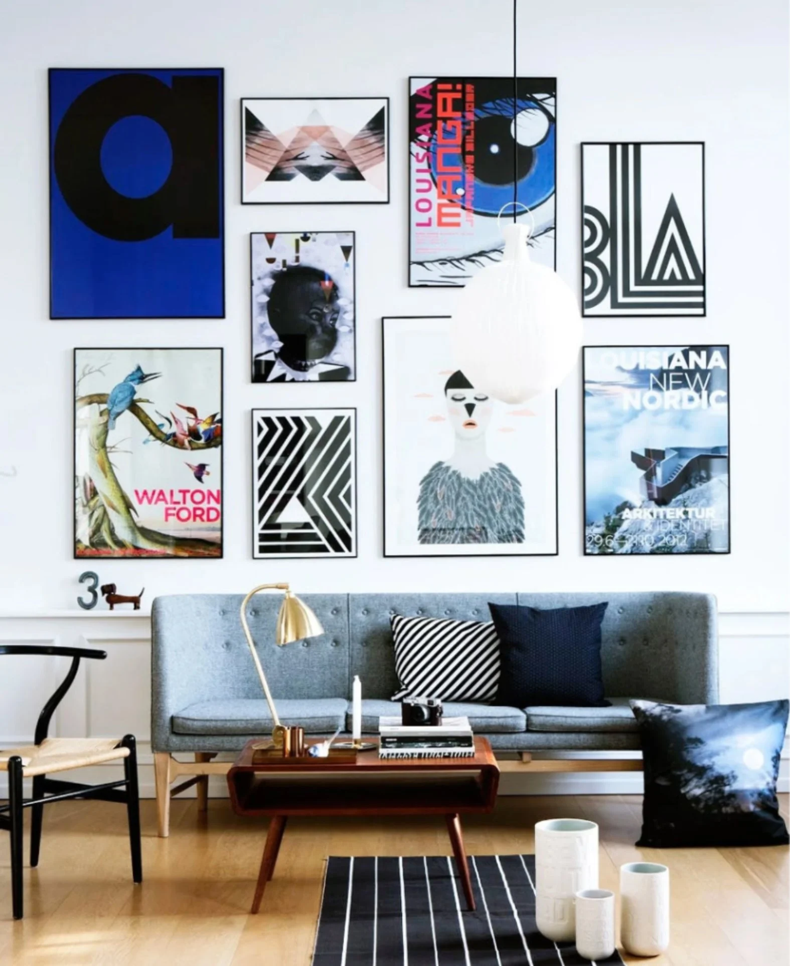
In the next image, Design Mag selected a bold mix of abstract, graphic, and illustrative pieces, creating a dynamic and modern aesthetic. The thin black frames unify the varied designs, adding a sleek, curated look to the space.
Frames: If you love a bold style, mixing different frames is a great way to create a unique gallery wall. One of my favorite things about a mismatched gallery is the freedom to blend various frame styles for a dynamic look. That said, using the same frame throughout is a perfectly stylish and much easier approach. The biggest challenge with the mixed frame look? Finding the right mix of frames!

In the image above, honestlywtf.com used a mix of frames to create a stunning gallery wall in her home office. I love the dynamic layout, with frames flowing from high to low for a visually engaging look.
The next image, Anthropologie showcases a curated mix of contemporary and mid-century modern art. The variety of frame colors and styles enhances the eclectic, artistic aesthetic.