Classic Grid Gallery Wall
I'm a huge fan of using gallery walls to bring personality, warmth, and character into a home! Over the years, I've installed more than 100 gallery walls for local clients, and it's truly one of my favorite ways to transform a space.
Welcome to my Gallery Wall Series! In each post, I'll help you discover the perfect gallery wall style to match your space — and showcase your unique personality.
Classic grid arrangements are ideal for structured spaces or when displaying a series of similar artworks with uniform frames. The key to a successful grid arrangement is treating the group of frames as one piece and ensuring that it harmonizes with the surrounding space.
Art Selection: Choose a single style of prints to create a cohesive look. Examples include family photos, landscapes, abstract paintings, or vintage designs.
Frames: For a cohesive look, use frames of the same size, colour, and style. Select frames that enhance both the artwork’s colour palette and the room’s decor.
The material also matters—metal frames add a sleek, modern touch, while wood frames bring warmth and timeless charm. If you're using the mats that come with the frames, keep it consistent—either use them for all frames or none at all.
Spacing: Leave an even amount of space between each frame, typically about two inches, to maintain a clean and orderly appearance.
In the image below, you see the TV area of my client’s home, located upstairs near the bedrooms. She envisioned this space with professional family portraits within the frames, making the grid layout a natural fit. Mindful of her young children, we positioned the frames sufficiently above the floor.
The image below showcases my teenage son’s bedroom, where he chose to display a collection of Nike sneaker prints. Given their consistent design, opting for a grid layout was the most suitable choice.
The next image captures a section of my living room. These photographs of my children were taken specifically with this grid arrangement in mind. The plan is to periodically update the display with new photos as they grow. Amidst the bustling activity of my home’s open-concept ground floor, this style serves as an understated yet elegant way to occupy space without it becoming the center of attention.
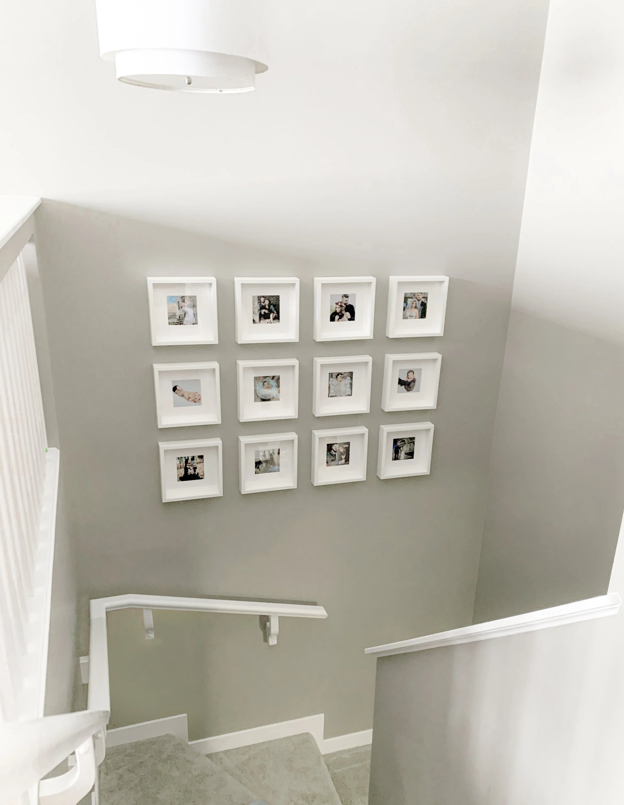
Below my client had an open staircase that overlooked the TV room upstairs. She envisioned a display of small family photos, and a grid layout was the perfect solution to complement the space.
The image below features my client’s formal living room. She wanted to display professional family photos, and the grid layout provided a clean, simple option that enhanced the room's elegance.
The last image showcases a grid wall in my client’s upstairs hallway. To the right is the master bedroom, and the hallway leads to the children’s rooms. The photos, arranged in the grid, include maternity shots on the left, a newborn photoshoot in the middle, and the latest birthday photos on the right.


